This article was originally published on Ko-Fi and may have been modified slightly.
Hi there! It’s an awesome time for me because I still get feedback from you for new features. One little feature I never thought of is the main part of this update.
I always get the feedback that you all love how fast you can track games and that it’s possible always when you see a game card. This is possible because I don’t care about page views (and still don’t track them) so I don’t care if you visit 3 pages or 50. I just want you to have a good time.
The new status selection🔗
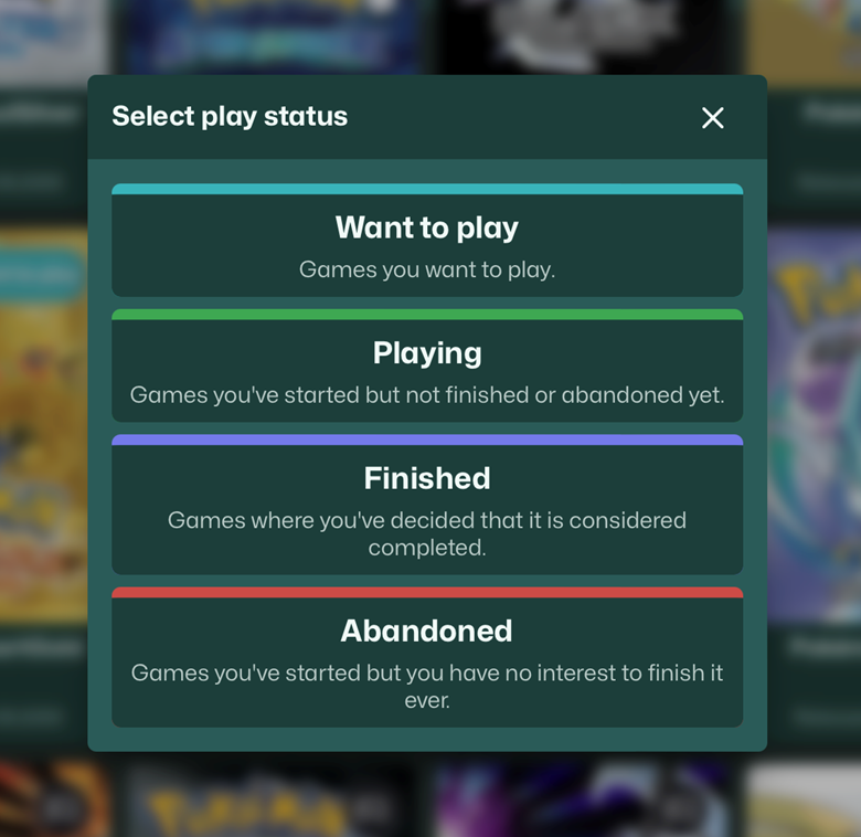
So the status selection was a bit rough until now. Still the first draft I did a few months ago when I just needed to function to test it. But I wanted to redesign it a bit for the new feature. So I searched for some icons and changed the layout so it’s easier to grasp and looks a bit better. Because I needed to get more space efficient.
The “big” feature is that you can now select one of you last three updated playlists directly in the status selection modal. I always tried to find a good way to add the playlist button to every card without bother you with a menu. It should still be possible to add a game to a play status with two clicks.
So this was an awesome suggestion from one of you and I needed to implement it. Before the update the play status selection modal looked like that.
Now it looks like that.
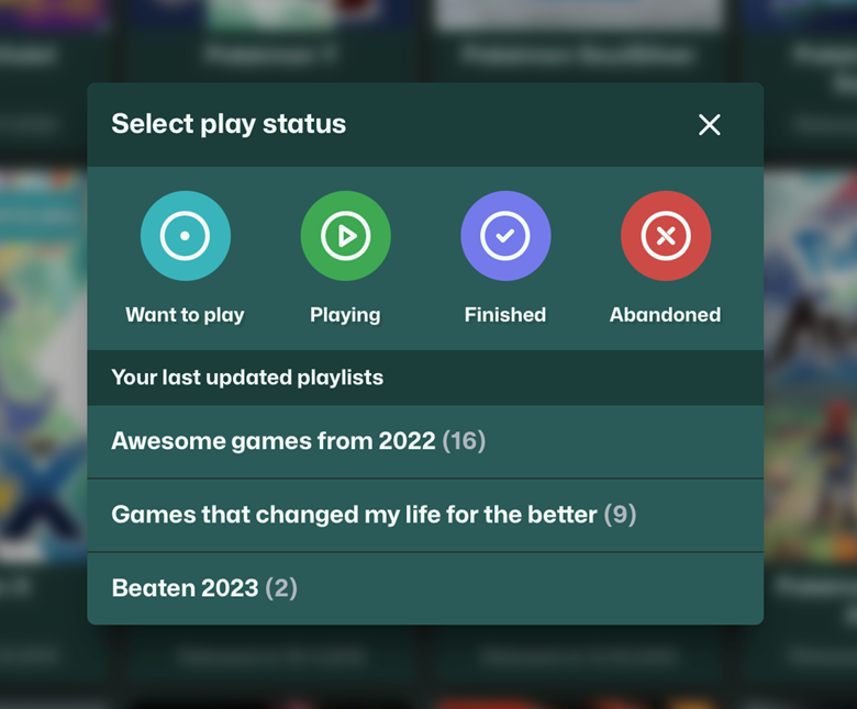
Awesome right? I like the new icons. They’re generic but I think they’re a good start. And I like to think about the dot in the “Want to play” status as something like »It could evolve into these other icons«. Maybe I can do some animations with this in the future.
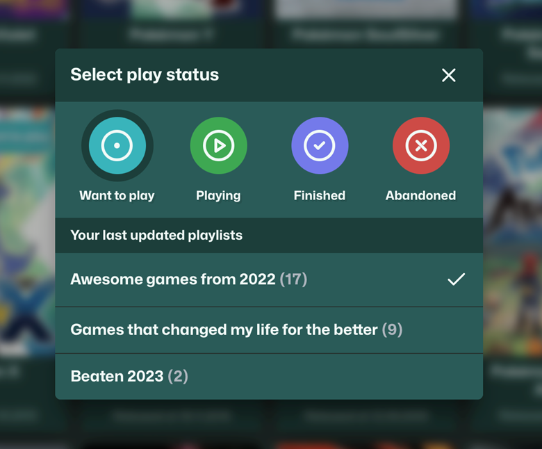
You’ll also able to see if the game is in one of the three lists and the current selected status.
Nothing too fancy but I quite like it for the first version.
Other changes🔗
So this is the “big” change in this update. But I tinkered a bit more on some other parts of Questlog. The play statuses on the game page and the play status navigation got the new icons too and a quick redesign.
Also the search suggestion is a bit less “sticky” again. If you clear the input it disappears instantly. Also a click away from the search closes it. A visual bug for the search form on smaller iPads is also fixed. But look for yourself. Here is the unfiltered changelog.
Changelog🔗
- Completely redesigned the status selection with new icons
- Made the status buttons a bit more accessible
- Added the users last three playlists to the status selection modal
- Refined the Design of the play statuses on the game page
- Refined the Design of the play status navigation
- Fixed visual bug if a playlist name gets too long
- Disabled unwanted hover effects on touch input
- Changed the visual layout of the websites
- The search should now me better sized on iPad
- Action buttons now have a clearer hover effect
- All buttons have now a much smaller border radius
- The search suggestion now goes instantly away if the field is empty
- The search suggestion now goes away when you click out of the search
- Optimized some stylings for badges
- The mobile navigation is now an overlay and fades in instead of moving the content down