Sorry, I had no idea for a cheesy title so I went with that. I guess the main topic of this update is clear. Reviews. One of the most requested features is finally here and I absolutely understand why you all asked for it. While testing the feature I already loved it. You were right. And as I was working on Reviews anyways I added something I always wanted.
Separated Ratings and Reviews🔗
As I said in the intro one of the most requested features just got implemented and it is the separation of Ratings and Reviews. If you want to rate a game but you have no idea what to say about it (or you just have no time) you can do this now in one click.
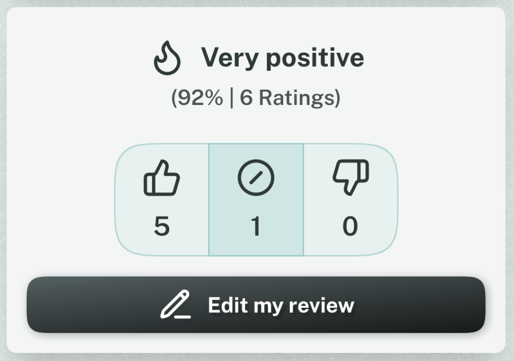
Just click the new Buttons on a Game Page to say if you like a game, if it’s just meh or if you dislike it.
After you rated a Game you also can write a Review. Both are connected, but the Rating works in stand-alone if you don’t want to review the game.
One of the main reasons is that even the most played games have not a single Review, but I know from Mastodon people wanted to say they like them. This way it’s super easy and maybe it encourages you to write something. But no pressure.
Spoilers ahead!🔗
If you didn’t write a Review, because everything you wanted to say would be a Spoiler (I was in this Situation multiple times), you can now mark your Review as a Spoiler.
It’s just a Checkbox in the Review form and the Review is blurred out for everyone. And as this is something people just say usually, I mean it. I tried to make this feature as accessible as possible and people with Screen Readers don’t see the text either. It’s inert and therefore it’s not visible for accessibility tech and people that can see and theoretically select the text can’t, as long as the Spoiler is hidden. So you can’t accidentally copy it. It’s surprisingly easy these days.
Squircles?🔗
Maybe you noticed something about the buttons in the Screenshots. They have rounded borders as usual, but it’s kind of different. Also the Action Buttons have a bit more depth and aren’t completely round anymore.
CSS has the wonderful new Property called corner-shape, that allows for easy Squircle-Buttons. Also much more, but I really love the Squircle shape for buttons as it makes them distinct in a design were other things also have rounded corners.
It’s not exactly like usual rounded corners, but also not a circle. The weird word is a combination of the words square and circle — squircle. Sound silly, but I like it.
I changed all buttons to squircle buttons. The Action buttons got a bit of depth with a gradient as I’m fed up with flat design. Inputs also got a bit of depth and I guess more and more of the UI will be changed in that direction. CSS is pretty awesome these days so I guess I can be more creative again.
Beware of Browser support. Firefox and Safari are still in the process of implementing the corner-shape Property and so the buttons there are just slightly rounded except for the Game Log Button, that is still round on game cards. But the moment these browsers support it, it will work directly. What do you think? Tell me on Mastodon.
Changelog🔗
As always, here is the unfiltered Changelog
Features🔗
- It’s now possible to Rate a game without writing a Review
- The review buttons now only appears, when the user has already rated a game
- It’s now possible to mark a Review as Spoiler to hide the content from others until they actively want to see it
Improvements🔗
- Change buttons to squircles and try to integrate more depth
- Optimize play status selection for keyboard navigation
- Give inputs more depth
- It’s now easily apparent how the distribution of the ratings is instead of only seeing the overall summary
- Change the label of the “Edit Review” button to “Edit my Review” to make more clear, that the user isn’t about to change a Review of another gamer
- In the German translation the Rating and Review are now separated (German would you “Bewertung” for both. The Alternative would be “Rezension” which sounds overly formal. As we are all Gamers and now the term “Review”, we also use “Review” in German now. As we already do for Playlist and Event)
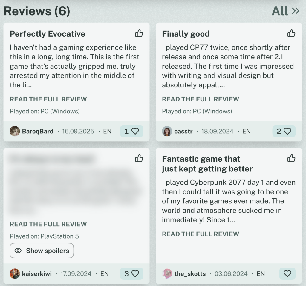
- On the page where all Reviews of a Game are listed, the Reviews are now completely expanded, making it easier to read all Reviews without constantly switching pages
Fixes🔗
- Some ares were not styled correctly in light mode
- Improve performance by updating some dependencies and change the way the JavaScript is bundled
- Playlists on game pages don’t have a random text decoration anymore on hover