
Hi everyone. No I had no better idea for a title.
Questlog, your (hopefully) favorite Game Tracker just got a big update to make it easier for you to Log, Review or Rate Games or put them on a Playlist or write private Notes.
The Game page got pretty much a complete overhaul. Some stuff is where it always was, but many things got optimized. There were also Improvements in the Relevancy of shown Games in various places.
Overhaul of the Game Detail Page🔗
Everything in Questlog is about Games. It should help you to discover new Games and Log what you want to play, playing right now or just finished. Therefore it’s quite important to see all the information you want. But… I went a bit overboard with that.
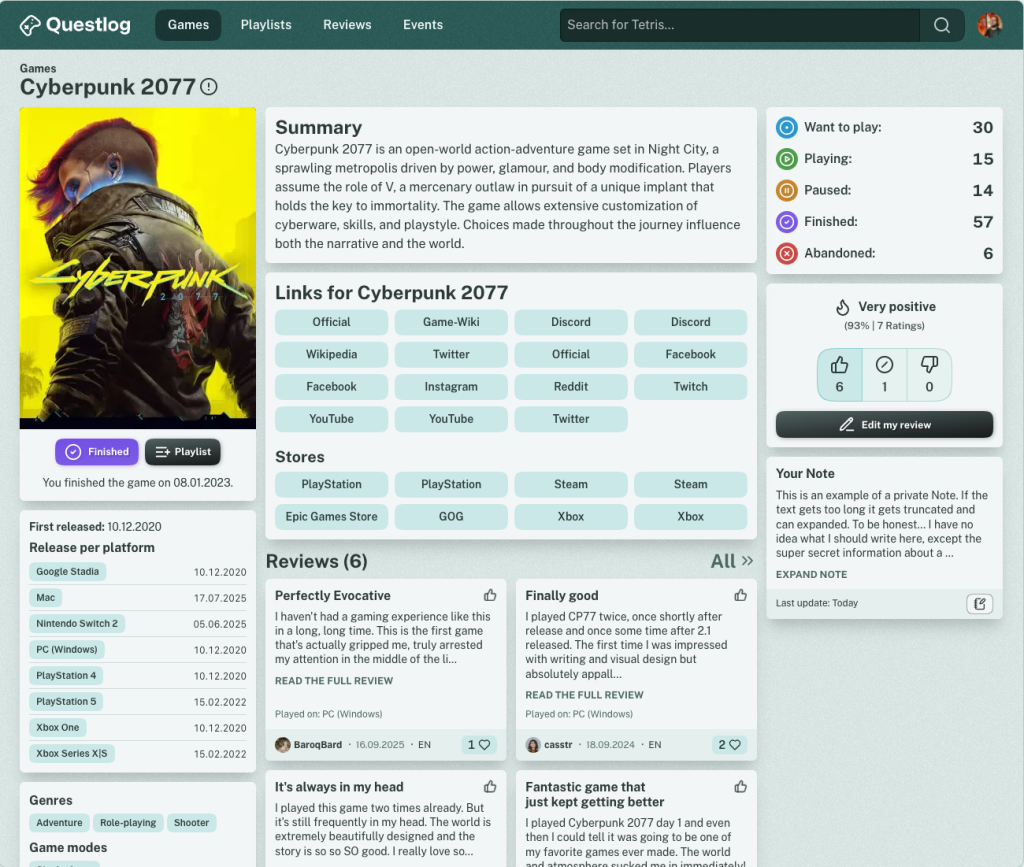
The Game Detail Page looked quite messy before Questlog 1.3.0 and I wanted to change “a few things”. But… I didn’t really know where to stop. This resulted in a complete Overhaul with only a few things left where they were. I think in a good way. There’s still room for improvement but I wanted to release the update same day instead of optimizing for another month.
But see yourself, this was the page before:
And this is how it looks now:
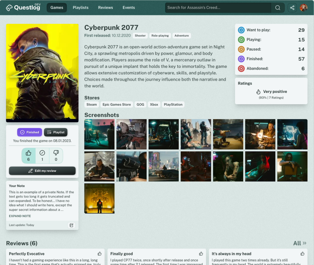
Quite a difference, right?
When I was almost ready I was left with much empty space below the description of the game in some cases (Quite a lot games only have a short description… I guess there’s room for improvement too, right?). And I’ve just discovered that I did way too much for getting images from the IGDB to Questlog. I learned that you’re allowed to Hotlink the images and don’t have to download them. Therefore the empty space was perfect for something I wanted to have for quite a while but didn’t because of disk space constraints — Screenshots.
Yes, the first version of Screenshots is on Questlog now. Currently only from the IGDB but this is the first step to the planned feature of User uploaded Screenshots. (Still no ETA, but I really want to upload my Screenshots myself :D)
It will take a day or two until every game has fetched their Screenshots but it will get there.
But that’s not the only improvement on the Game Detail Page. The area “Above the Fold” got cleaned up and regrouped. Instead of having a million boxes with a ton of information directly at the top there are only half a million boxes! Well no, I restructed the content, removed the boxes around content and re-grouped everything.
Also every Action is now right below the game cover. Especially the option to Rate and Review a Game was hard to reach on mobile. Not anymore. I’m not super happy with the right sidebar, but that’s an optimization for another day.
Speaking of mobile, that’s how it looks when you open a Game Detail Page now:
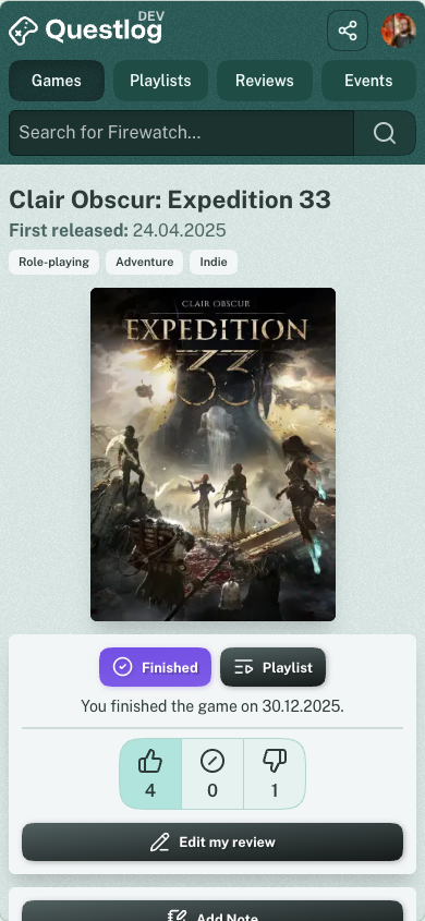
Reviews got a bit more space and Events take less space now, as they’re collapsed like the videos when it’s more than 4. More information about the game is now found below the Similar Games section (That get’s much better results now, but more on that further down).
Then there are the Children of a Game. Like DLCs, Updates and Stuff. That was… messy before. A game like Sea of Thieves for example has 34 Children. They where all visible. Even if you only cared about DLCs for example. It was ordered by Release date and not grouped so it was hard to get anything useful out of this grid.
This was how it looked before together with the Similar games:
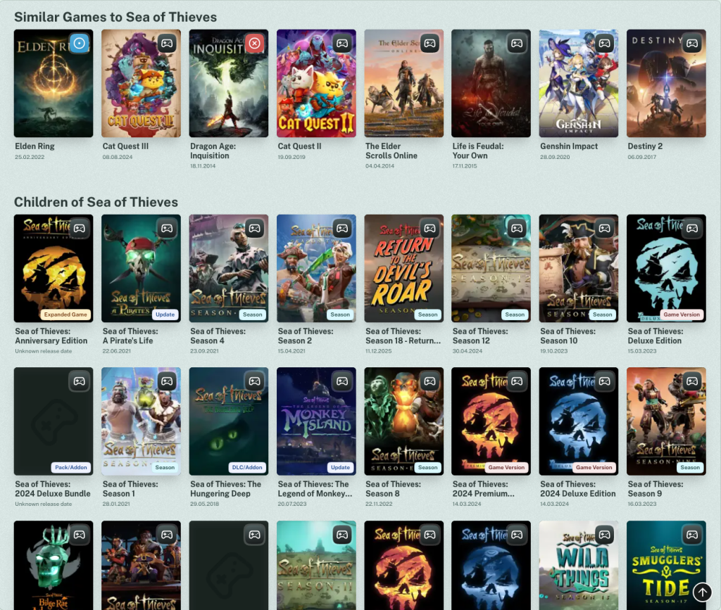
And now it’s that. Much cleaner, right?
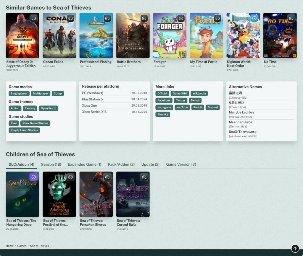
In the new Version of Questlog you now have Tabs that group the Games by type. In there they’re still ordered by date, but also by Relevancy (more on that further down), so you’ll definitely get more out of it. I already discovered things through that while building this. I hope you like it!
Better Similar Games🔗
For a smooth transition from the Game Detail Page to the Relevancy Score lets talk about Similar Games. These were quite… Trash. Let’s be honest it was just something. Initially I just used the ones from the IGDB and was not satisfied to be honest. Most Games just had the same Games listed as Similar and I didn’t like it.
So I wrote my first algorithm and it was more diverse but even worse.
Cyberpunk was similar to Pokémon, Unreal Tournament, Zelda, Elden Ring, Mario etc.
Sea of Thieves was similar to Elden Ring, Cat Quest, Genshin Impact etc.
Pokémon Fire Red was similar to The Last of Us, Eldenring, Red Dead Redemption, Journey, Rhythm Doctor (great game by the way, check it out) etc.
You see the Problem? Elden Ring was apparently quite often there. Rhythm Doctor was also Similar to Elden Ring. And Elden Ring itself was similar to Cat Quest 1-3, Dragon Age and Elder Scrolls Online. Well. The problem was the matching of Genre, Game Mode and Theme. Elden Ring is Fantasy, a Single Player game and Open World. That matches with pretty much everything.
So I wrote a much better and more sophisticated algorithm that matches far better and is better to build on. For example when I add Franchises I can improve this one quite a bit. The current version is far better but not quite what I want. But for more I need more data.
Relevancy Score🔗
When I saw how much better results can be, I wanted more. The trigger was actually my wife that told me about a new DLC for Diablo 4 that was about to release the next day. Well… It wasn’t on the homepage despite the fact that it was quite a bit more relevant than most of the other >30 games that released on this day. Why? Because the sorting was quite… basic. Everything from the same day was just sorted alphabetically.
Diablo IV: Lord of Hatred though had user interactions. A Playlist and 2 people wanted to play it. So it should’ve been on the start page. And in the future it will be. (Well, not that game but other releases)
I wrote a quite extensive additive algorithm that calculates the Relevancy of a Game based on user interaction. Cyberpunk 2077 for example is the game with the most user interactions. 7 Ratings, 122 Status Logs, 6 Reviews, some private Notes and it’s on 35 Playlists. All these things now are counted into the Relevancy of a game. The score is open to the top so I can extend it by any other metric I want. For example when User Screenshots get introduced this could increase the score. A Game where a User uploads a Screenshot is probably more relevant than another, right?
As not every Game has User Interaction there’s another metric: Time! Time makes everything more complicated and better! Well it’s easy. If a Game comes out in the next 3 months or was released the last 18 months its more relevant as Games further in the future or in the past.
This worked out so well I not only use this Score for Upcoming Games and Latest Releases on the homepage of Questlog, but also for all listings and it’s a low priority metric in the Search now.
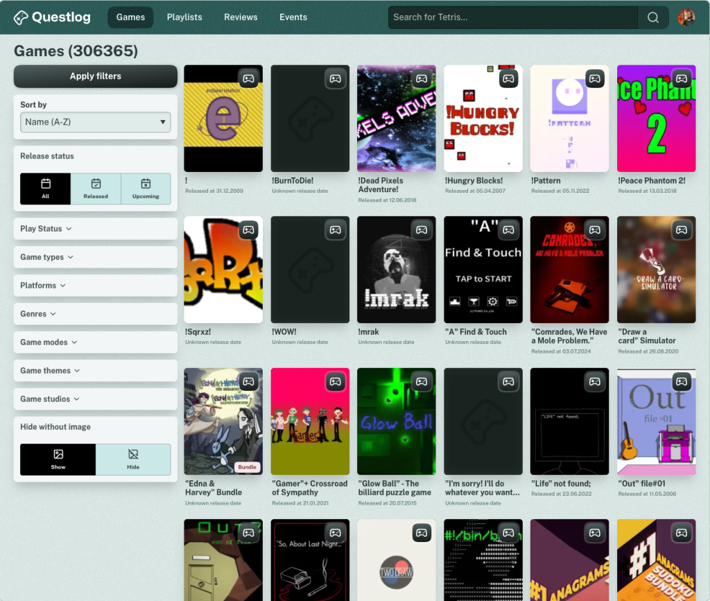
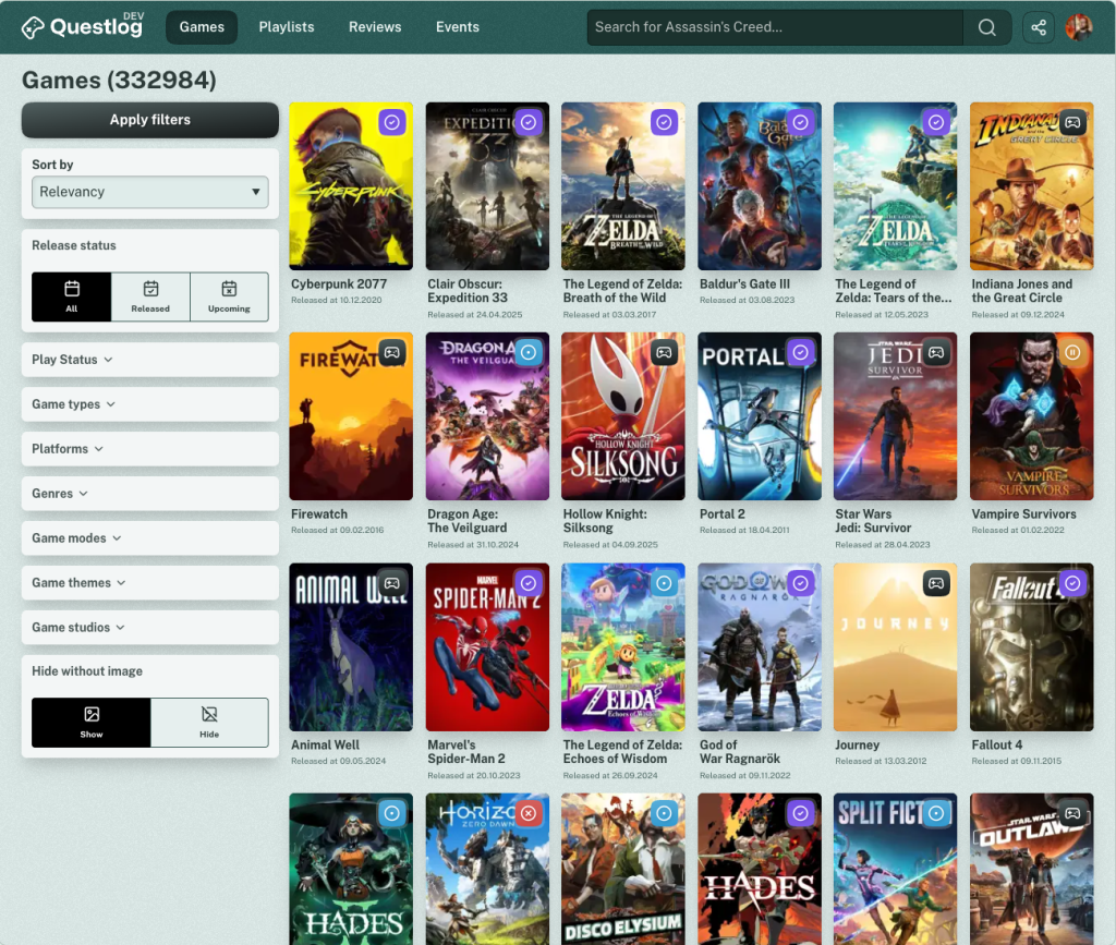
So if you click on games at the top navigation you don’t see the same games as before. It’s not sorted by name anymore but by Relevancy (You still can change the sorting to name if you want to see the Game ! on top for some reason — I have no idea what this is).
The awesome results before:
And now with Questlog 1.3.0:
Also if you search for Cyberpunk you see the same great results as before but you also will see Cyberpunk 2 suddenly appearing as it has User Interaction and is therefore more relevant as Cyberpunk Samurai from 2024 (That looks good, but according to the PlayStation ratings it’s not that good — Anyways…)
I will improve this Score in the Future and will probably add Relevancy sorting in more places where they make sense.
It’s calculated every night as the calculation is quite slow so don’t expect a game at the top for something that you just added somewhere. If the User Interaction increases I will calculate the score more often. Currently it would be quite pointless I guess.
Share Sheet🔗
For other things I improved… Uhm. Ah yes. You constantly asked about a Share Button. For people that were using Questlog as a PWA it was always there… but only on the Game page. Now it’s always there for everyone. In the header is a small Share Icon (I decided for connected dots as this seems more recognized that the weird box with the arrow from iOS).

If you click or tap it you have three options: Copy the URL, use the native Share Sheet of your system (If the Browser supports ist, Sorry Firefox folks) or… Scan a QR Code? What year is it!? I just found it fun to play with it and I constantly see people sharing links via QR Code in the train and stuff. So I thought it would be fun. And the Share Sheet looks better with it too.
I could write about more stuff, but I’m already at 2,000 words and nobody will read until here… So here’s the Changelog with everything I mentioned and didn’t mention 😀
Changelog🔗
As always here’s the unfiltered Changelog
Features🔗
- IGDB-Screenshots on the Game Detail Page
- Add internal Relevancy Score based on User interaction with a Game (It also takes the release date into account)
- Upcoming and Recent releases now use the Relevancy Score as a secondary sorting after the date to show more relevant games first
- Add Relevancy sorting to all sortable listings and make it the default
- Add Relevancy Score as a low priority metric to the search to improve the search results
Improvements🔗
- Restructured Game Page
- Restructure where information on the Game detail page sits
- Clean up the design of the Game detail page to make it a bit more modern
- All User actions are now directly below the Game image
- Game Variants are now grouped in tabs, so it shouldn’t a overwhelming anymore
- Alternative Names are now always visible instead a of a tooltip
- Improve algorithm for the Similar Games group
- If a game was shown in more than 4 events only the recent four are shown initially
- Store links on the Game detail page are now more prominent then the other links
- Remove localization of Store links on Game Detail Pages so that everyone gets their preferred localization
- Combine iPhone and iPad Store Links on Game Detail Pages to just iOS
- Order Store links on Game Detail Pages the same way
- Optimize the sorting of game children on the Game Detail Page
- Reduced the JavaScript Footprint quite a bit
- Review listings now show three instead of four reviews in a row
- The Review detail page is now more modern and should be more readable
- On the Game Review listing all reviews are now fully readable instead of shortened
- Games that were synced from the IGDB and got deleted some day are now automatically cleaned up after a while
- Upcoming and Recent releases on the homepage now show badges for the type of the release (For example DLC or Expansion)
- Add DLCs/AddOns to the basic filtering of pretty much everything that doesn’t show every game type
- Increase the number of games on the games listing and status pages from 24 to 30 and optimize spacing
- Optimize the results of the most played and most wanted groups to take the date into account (This will help that the games change over time and not just show the same 8 games forever)
- Optimize Icons for Playlists
- Remove “Window Executable” and “Other” from Alternative Names as these weren’t not helpful in any way
Accessibility🔗
- Collapsible areas are now more accessible for screen readers
- Mobile fonts should be a bit bigger
- Optimize a bunch of colors to make stuff more readable in light and dark mode