
Light mode is here! Yes really. I started Questlog with dark mode only as this was what gamers expected. Or at least I was thinking they expected dark mode. Anyways, dark mode or light mode isn’t only an aesthetic choice but more importantly a matter of accessibility.
Ironically I didn’t have time yet to add a light theme to this blog. But in this case reader mode might be a good tool to “fix” this. But I’ll add light mode here too some day.
To test the new light mode I implemented a few other changes so I could work with the light mode for a bit. That was definitely a good idea as I found some places where I had to correct the presentation. If I still missed something please let me know on Mastodon.
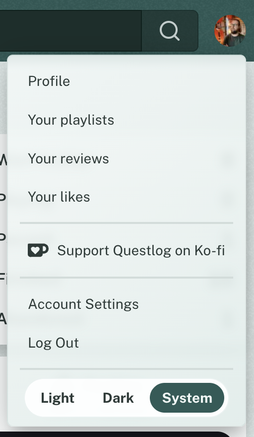
The light mode is applied automatically if your system is set to light mode. And the dark mode respectively too. But if you want to switch it’s in your user menu and set it fix to a specific theme.
I don’t think there is much more to talk about. Except maybe that the Browser targets for Questlog got increased as I wanted/needed to use some newer features. These are:
- CSS Cascade Layers
color-mix()light-dark()- Relative color syntax
Therefore the new Browser targets are:
Chrome: 131
Safari: 18
Firefox: 133
Baseline 2024 (September 2024)
I still don’t track my users so I have no idea which browsers you all are using. But I would guess Gamers have browsers that aren’t older than a year. If you use any of the versions above and something looks off, please let me know on Mastodon.
Changelog🔗
Features🔗
- Questlog now has a light mode!
- There is a theme switcher now in the footer
- Events that are currently running are now shown on the home page and in a separate group on the Events index
- Events can now be liked
Improvements🔗
- Optimize colors for the “Want to play” and “Finished”
status to be more readable and have a better contrast to other statuses - The color of the status navigation buttons is now relative to the status color to make it “pop” a bit more
- Optimize and unifiy colors in all places
- Optimize spacing in various places
- Optimize the order of the search results for events by event time
- Optimite the order of the search results for games by release date
- Completely remove Tailwind for good 🎉
- The no image placeholders now have a small inset shadow to distinguish them better from the background
- The end time for Events is now also shown
- The duration of an Event is now shown on the events page and in listings
- If the release of a game is yesterday, today or tomorrow it doesn’t show the date but the friendly name instead
- Optimize some translations
Fixes🔗
- The title of the recently and upcoming released games pages is now localized
- The sticky headers of the game release pages don’t overlap the user menu anymore
- The playlist search suggestion should now show the same results as the playlist search page
- If an image for videos or events can’t be loaded it now shows a fallback image
Accessibility🔗
- Lists with the Safari Voice Control are now way more accessible
- Use correct ARIA attribute for a selected play status in the play status selection
- The ARIA attribute for the current page is now correctly set on the link instead of the list element for the play status navigation