It’s been a while that Questlog got an update. Burn-out and Depression were big parts of my life the last month and I just didn’t have the energy for this. But I wanted to do something. Something new. Something shiny.
For a new feature the energy was definitely not enough. But a few months ago I asked on Mastodon about something that should be easy. I can inform you, nothing is easy when you are burned out or depressed. But it was achievable and that was the main goal here. Something achievable that you can see.
The first commit to this was actually pretty much exactly a month ago on June 28th. So even if it’s only a small update, it took a while. But I more and more found my motivation. I got more and more energy. I learned a bit more about design, accessibility and UX. And so I improved (hopefully) the design in multiple areas.
New Cards🔗
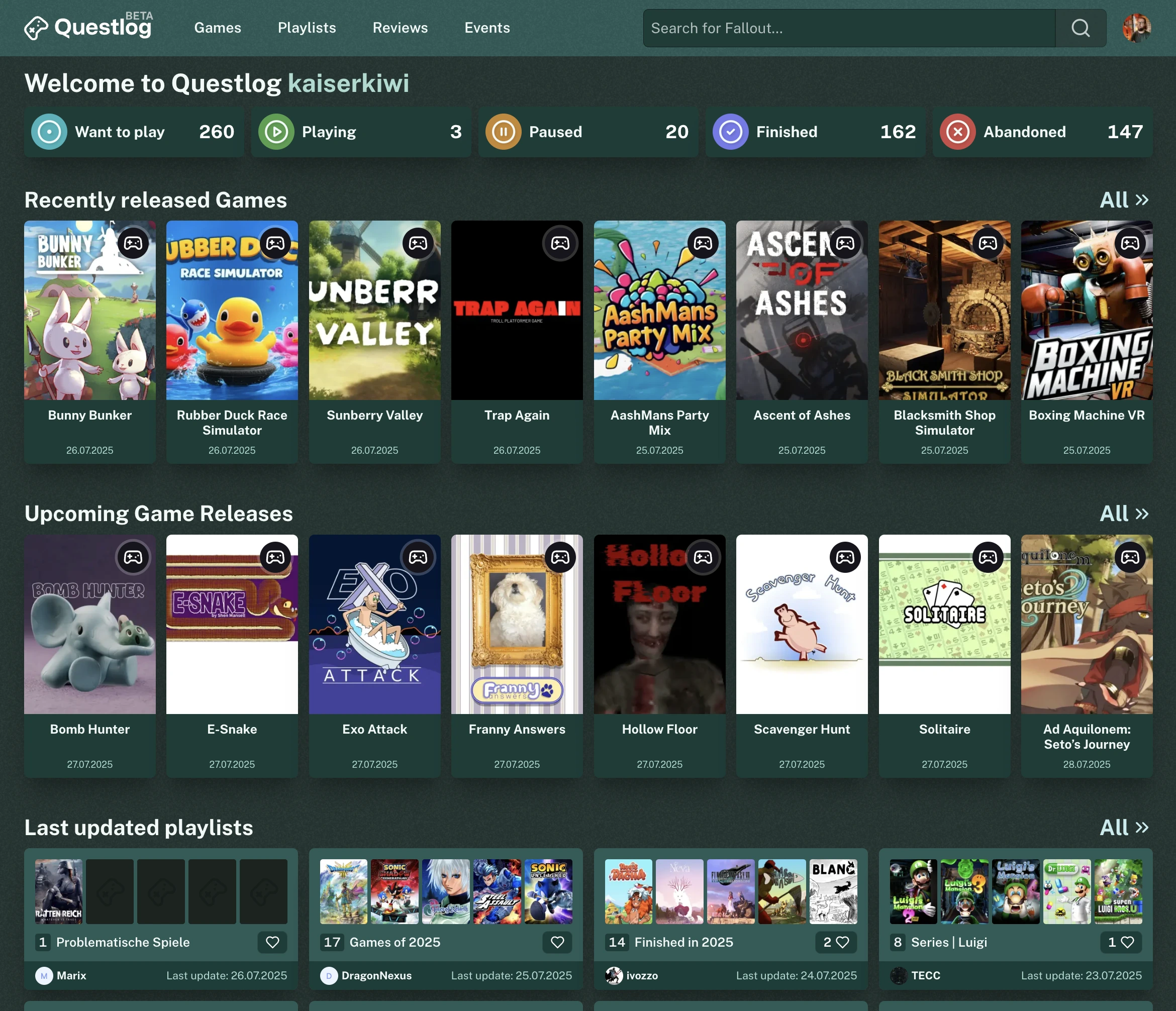
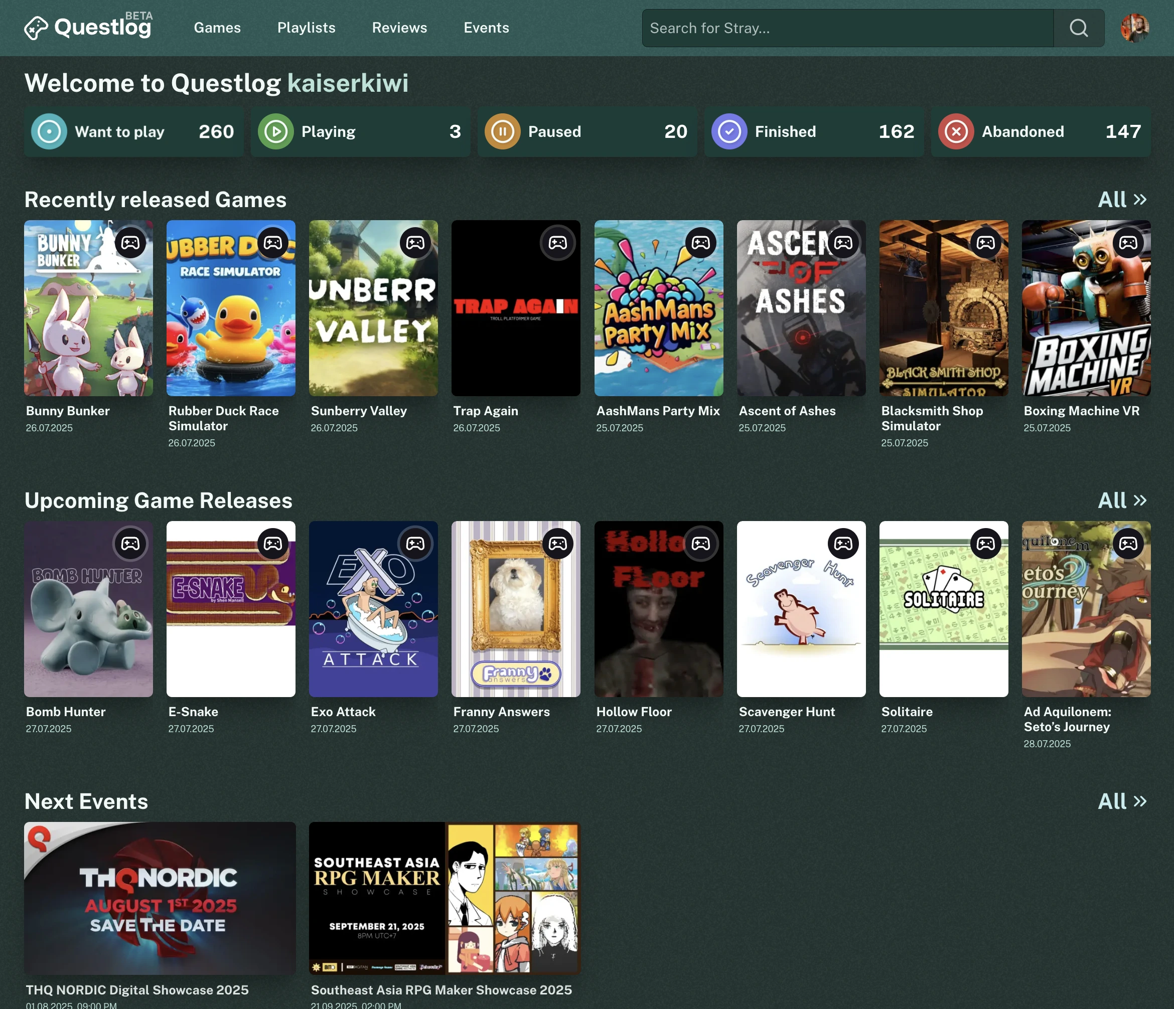
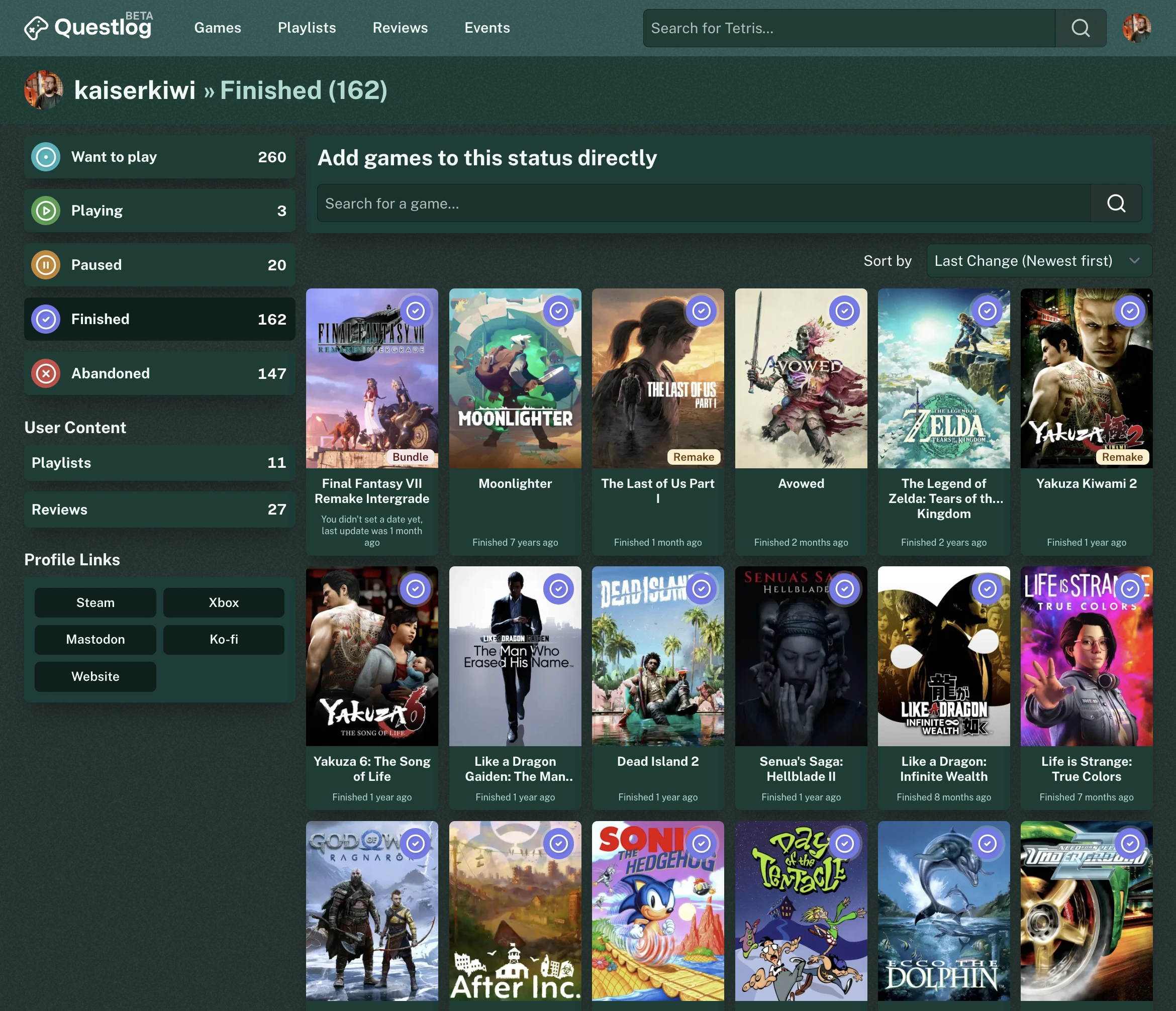
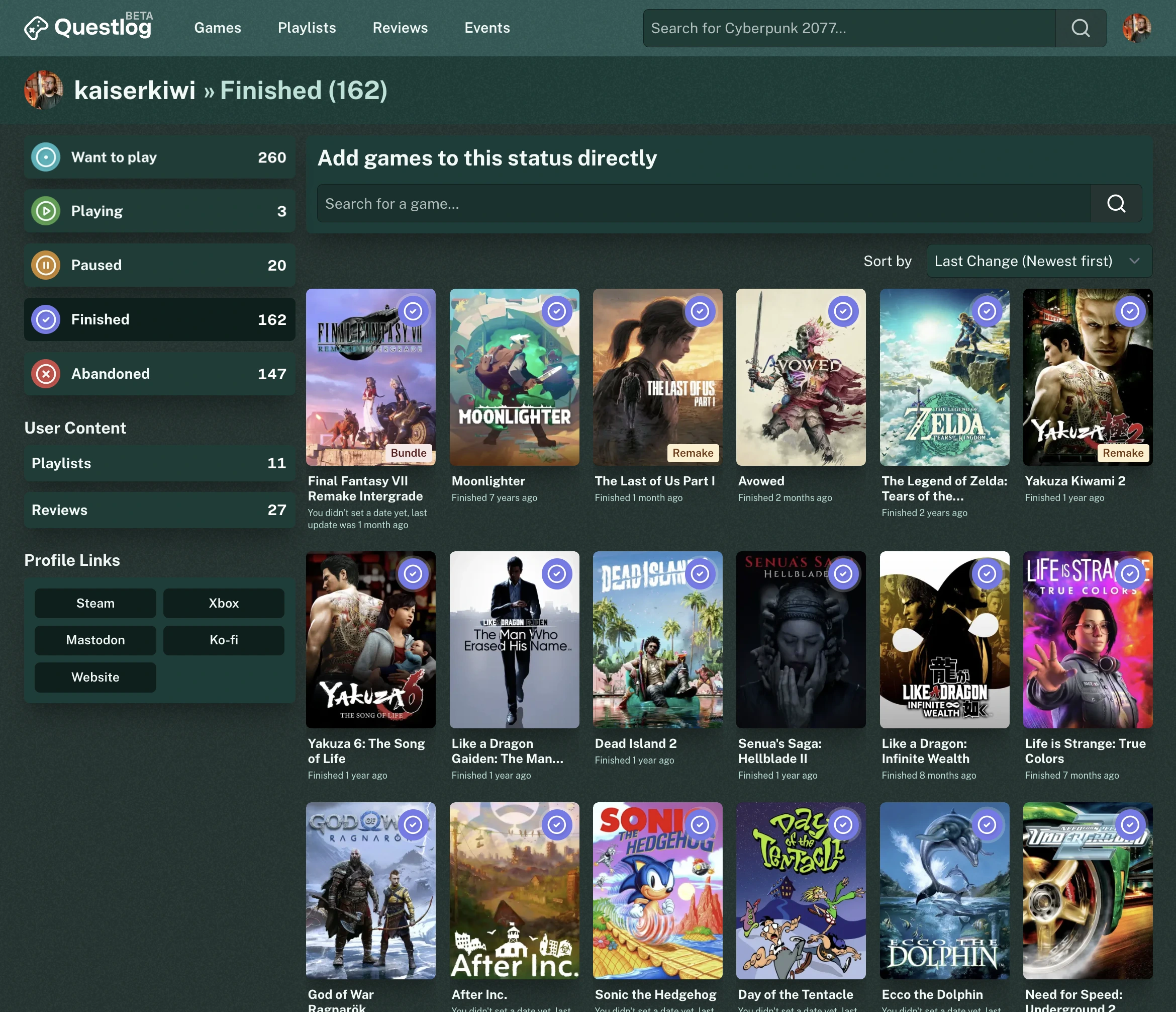
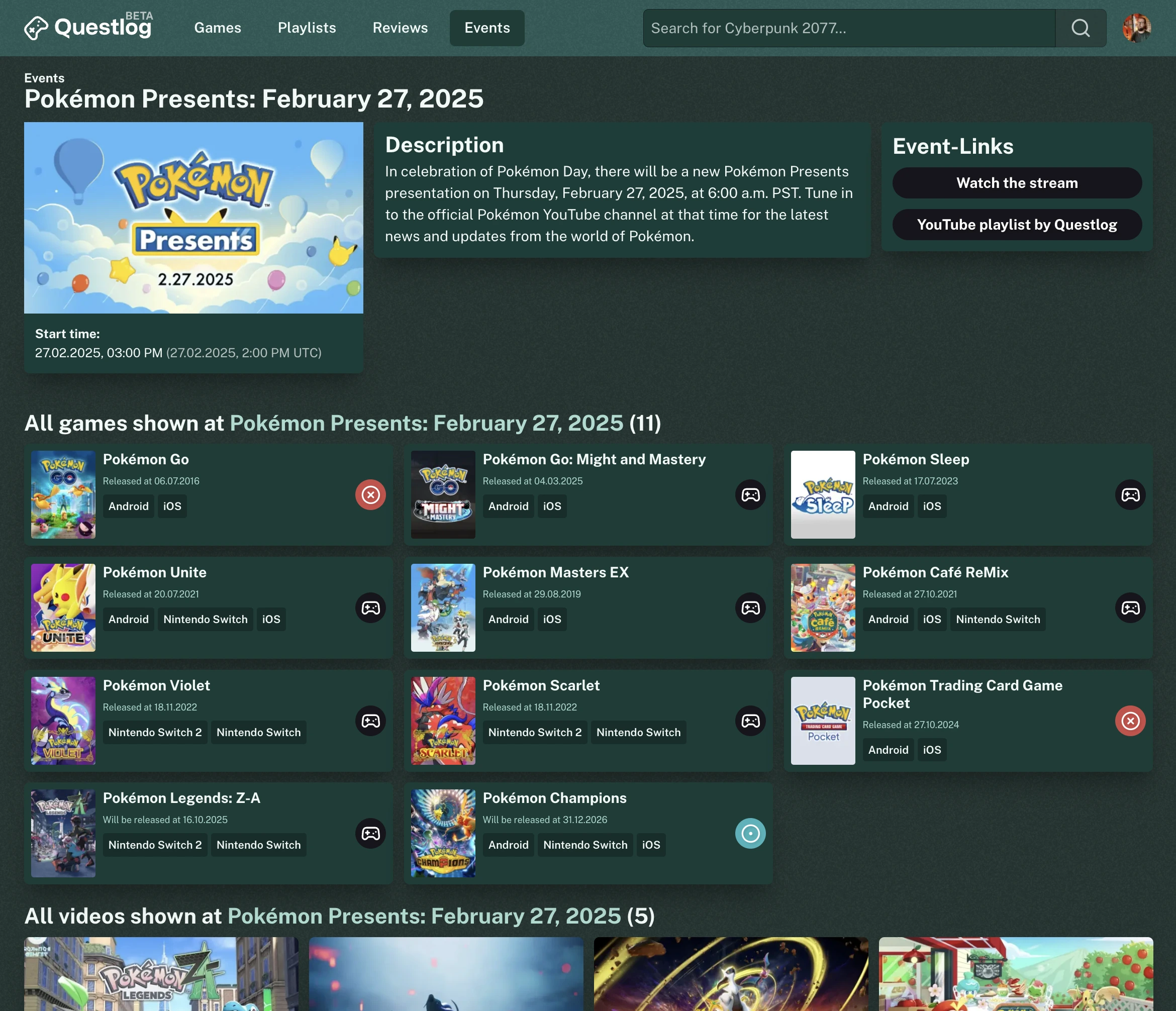
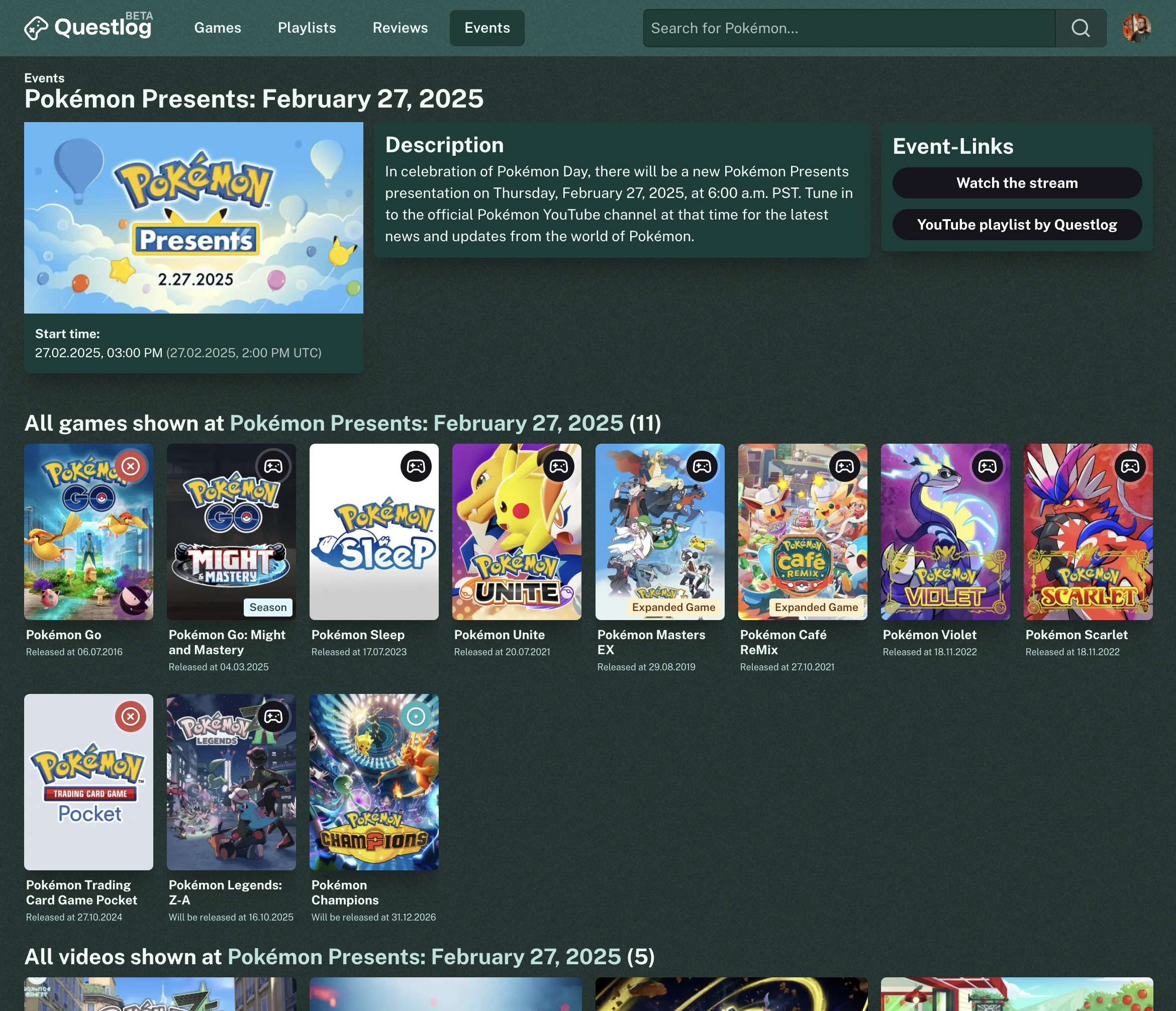
The most obvious change will definitely be the card design. As I asked back in February on Mastodon the cards are now more open and the text is left aligned. But I also improved typography a bit, completely changed the hover to be more obvious and much more performant. I
learned that a transtion on the box-shadow property in CSS is extremely performance intensive (relatively spoken, but even modern device struggle with reaching 60 fps here sometimes). And as I want Questlog to feel good even on older devices. Also I don’t want Questlog to suck up you battery just for a pretty box shadow.
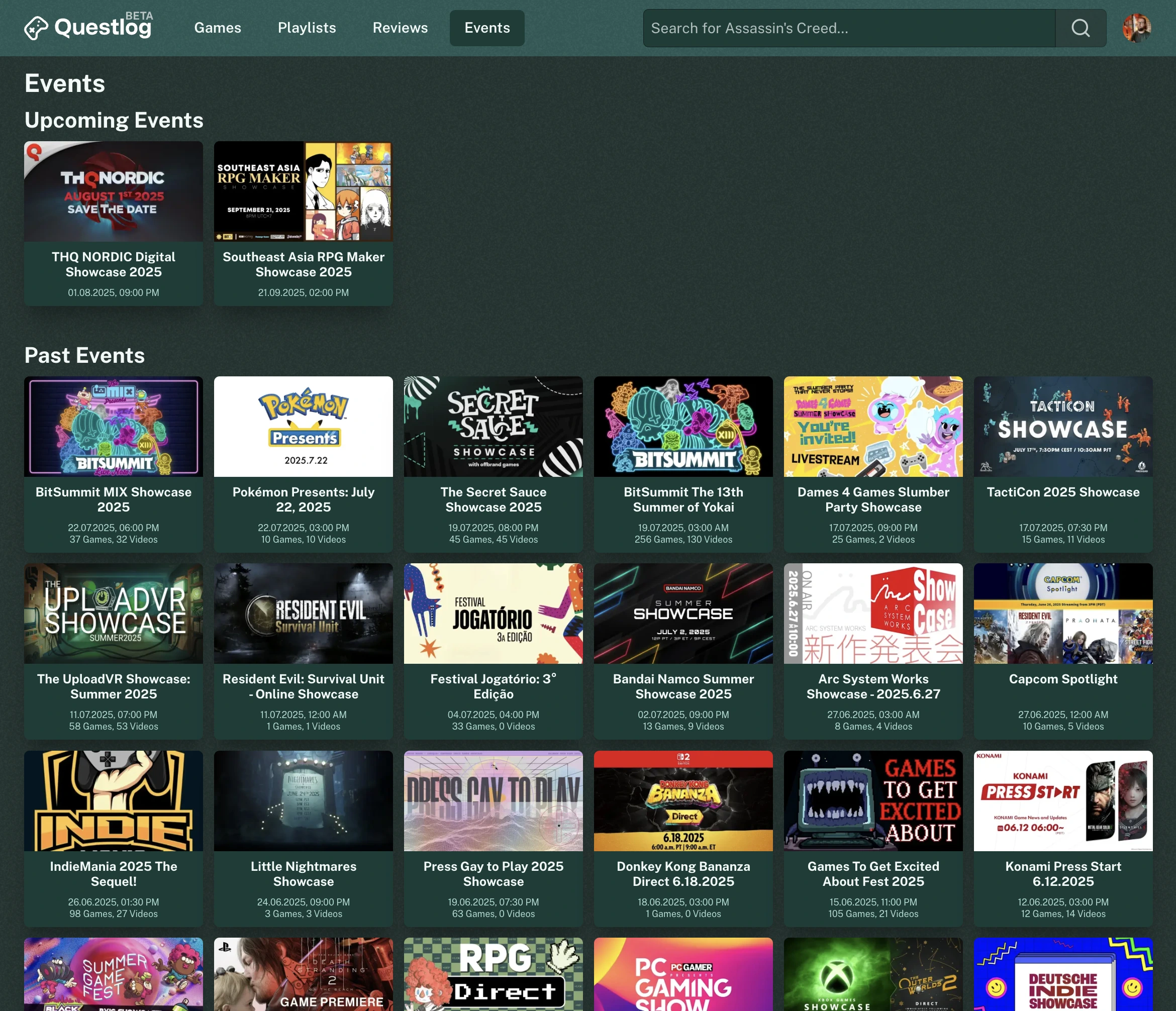
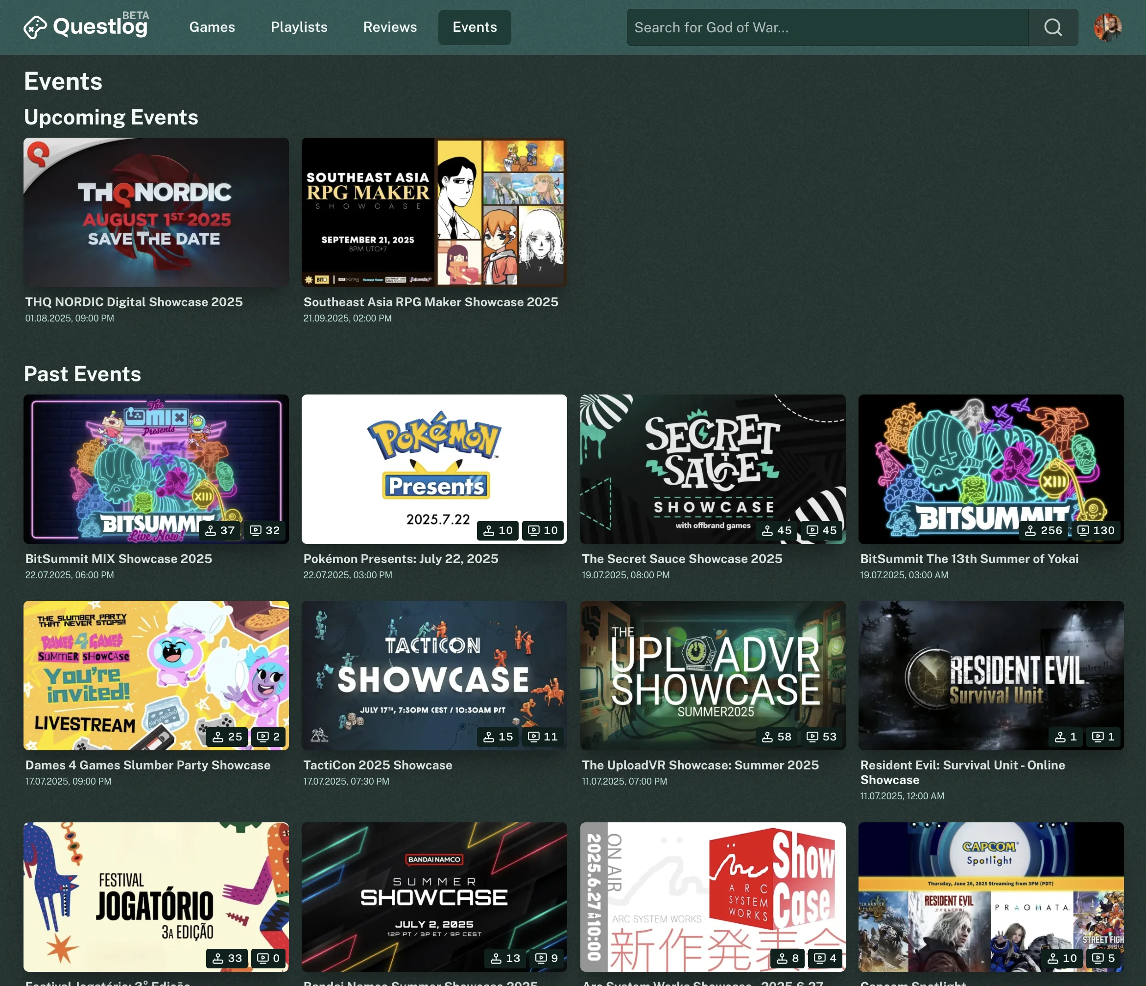
I decided that not only the game cards should be updated. But also events and videos got a new, similar look. For events the videos and games that are listed in them isn’t just a text below the date but it’s visible in badges overlaying the event image. Also the event cards got much bigger. And because it makes sense, upcoming events are now also visible on the home page.
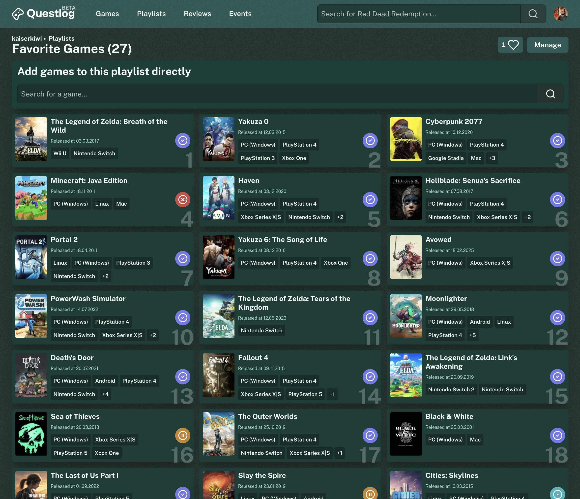
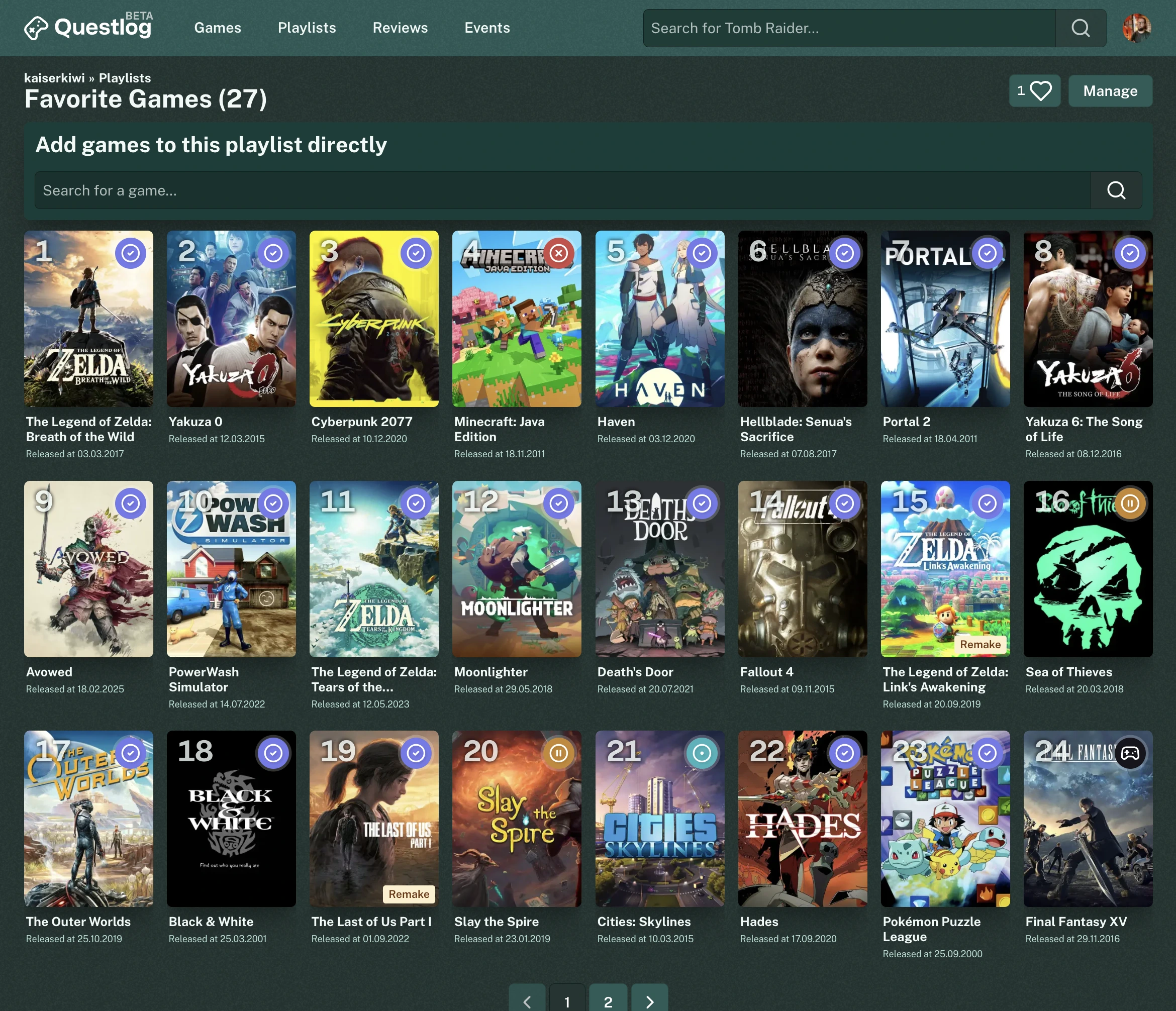
I also scapped the “list” design of game cards. It was weird and never brought really anything to the table that was “better” than the regular cards. They were introduces when I added ranked playlists, as I needed a place to put the number. But I never really liked them. I also used them in the events but I really don’t know why. So both now use the regular cards and the number for ranked playlists just overlays the image. It’s not perfect but good enough to release and collect feedback.
Here are a few comparison screenshots. Left before, right after:
Other changes🔗
The rest of the changes came when I just surfed Questlog and realized stuff I didn’t like. For example, when you type something into the search bar the suggested games are popping up. If you unfocus the input the list vanishes. So far so expected. But it stayed closed. Even if you focused the input again. It’s a small detail but it was annoying me.
Also a pretty annyoing bug in the Steam game import was present I hope no one of you ever encountered. If the play status selection is open you can press the numbers 1 to 5 to select the status. (Yeah I know, it’s hidden)
This listener was started when the component was loaded. Which made sense, when I first introduced shortcuts. But on the Steam game import page there are multiple of these selection components loaded at the same time. So if you pressed 1 for example, every game of the page was moved to your “Want to play” status. I’m glad I catched this accidentially on my local version. 😅
Other changes are improved accessibility in multiple smaller cases and improved readability in some areas.
The full changelog as always below:
Changelog🔗
Features🔗
- Show next upcoming events on the home page
Improvements🔗
- Clean up game cards, video cards and event cards to have a cleaner look
- Improve hover effects for multiple areas of Questlog to make it more predictable
- Add active (means click or tap) state to list items
- Reduce the CSS footprint by streamlining some components
- Add counts for videos and games for events as badges to the image instead of showing text below the time
- Event cards are now bigger
- The video and game count of an event is now also shown on the Game page
- Ranked playlists and Games in Events now also have a grid view
- Move playlists and reviews together on the home page
- Improve colors for resting and hover state on playlist items
- Various typography improvements
Fixes🔗
- The sticky headline on the release lists now don’t cover the hover effect of the game cards anymore
- In the list of the imported Steam games pressing a number doesn’t set the status for every game anymore
- Remove transitions on box-shadows to improve performance
- Improve contrast for muted color
- Add missing border radius to Steam game cards
- When the user removes the focus from the search the search suggestion isn’t removed anymore but hidden until the user focuses again
- The Dropdown component is now much more accessible