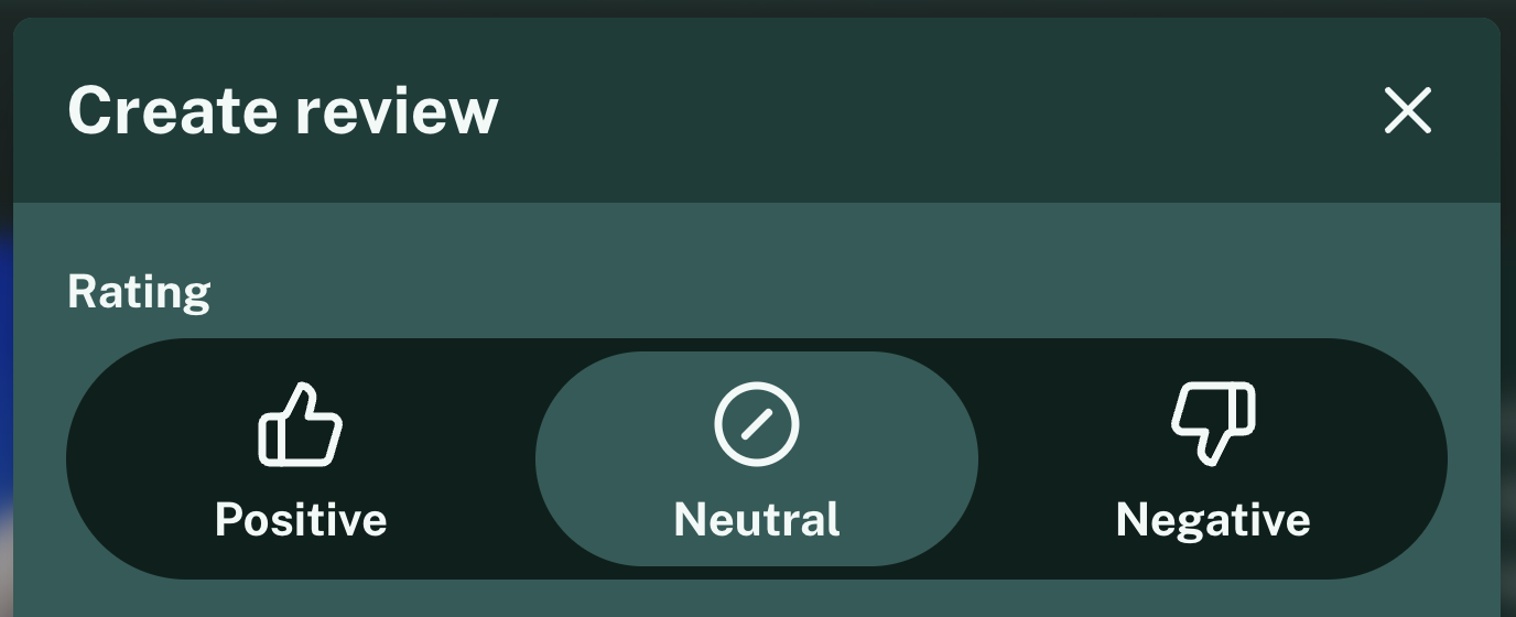
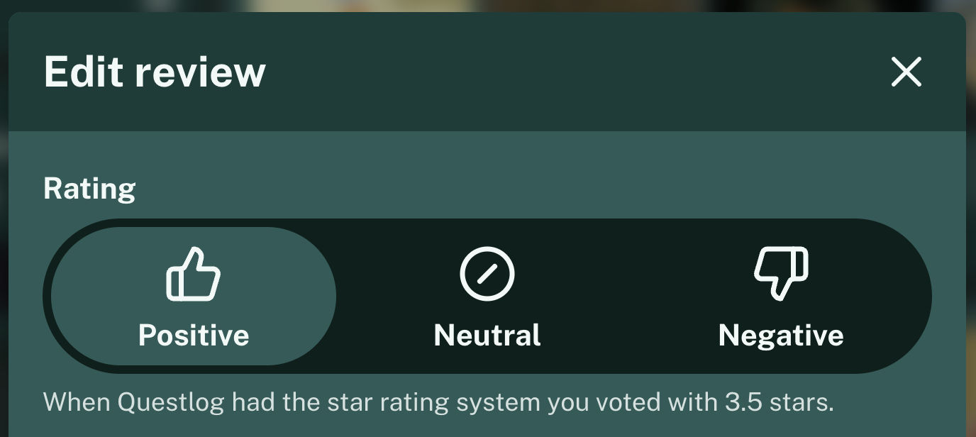
Hi there! Long time to update. At least nothing as big as the Events. To be fair this one isn’t as big too but I wanted to change this for a long time and after my summer break I finally had the time and energy for this. The review system just got a bit more simplified and changes the way it works.
Since the Events update there were 11 smaller updates I only wrote about on the Questlog Mastodon-Account yet but not here in the blog. So they will be part of the changelog. But let’s get into the changes.
Stars are gone🔗
First of all: I removed the star rating system. In my opinion it’s confusing and what’s really the difference between 4.0, 4.5 or 5.0. Either you like it, you dislike it or you can’t really decide (or feel neutral about it). That was feedback I got multiple times and I wanted to address it.
I implemented reviews back then when Questlog started as the first user request and never really thought about it much as everyone uses a stars system, right? Well not everyone but it’s pretty common and always has it’s flaws.

That’s the reason you now can chose between “Positive”, “Neutral” and “Negative” in a review. I automatically converted every rating to one of these three ratings via a simple conversion we figured out together on Mastodon:
0.5 to 2.5 => 0 (Negative)
2.5 to 3.5 => 0.5 (Neutral)
3.5 to 5.0 => 1 (Positive)
So you don’t have to do anything to convert these. But maybe you want to take a look at your profile and look for your reviews to check if someone now looks too positive or negative. If you aren’t sure what the previous rating was there’s a small info in the edit form now. It get’s removed when you edit the review.

Calculation of the rating average🔗
As was implied above internally the rating is now between 0 (Negative) and 1 (Positive). Based on that a percentage gets calculated for the overall score of the game also known as the rating average. It’s simply shown as a percentage in the frontend. If a game has four reviews two are positive and two are neutral the average is therefore 75%.
(1 + 1 + 0.5 + 0.5) ÷ 4 = 0.75 × 100 = 75If a negative review is added it’s only 60% and so on.
This gets shown on every game page now with two extra steps. If a game is rated over 75% and has five or more reviews it gets “Very positive” with a small flame icon. If the same review count is true but it gets below 25% it gets “Very negative”. I think this makes it easy to see with a quick glance how good a game really is rated.
Platform on Reviews🔗
One highly requested improvement for reviews was to add the platform you played a game on to a review. I think this information is so valuable to others that I not only added it to the reviews but also made it a required field. Reviews that were saved without this information are still visible but if you want to edit it you now have to select a platform.
Available are only the platforms a game has released on already. So even if the game has 3 listed platforms it can be that only two are available when the game isn’t released on the third platform yet. This happens often with times exclusives.
If the game was only released on one platform yet it gets preselected.
Changelog🔗
As always, the unfiltered Changelog:
Features🔗
- It’s now possible to add the platform for a review
- The platform is now required in reviews to make the review more valuable for readers
- Existing reviews can exists without a platform but if they’re edited it’s required to select a platform
- Only platforms the game is released on are available
- If the game was only released on one platform yet, this one is preselected
- Add a simple navigation to a user profile to get to their Reviews and Playlists easier
- Add
/playlistsroute to game pages showing all playlists a game is in - It’s possible now to select the preferred date format in your profile preferences
Improvements🔗
- Instead of using a 0.5 to 5 star system for Reviews it’s now only Dislike, Neutral or Like
- In the Background this corresponds to 0 (Dislike), 0.5 (Neutral), 1 (Like) making it much easier calculating a percent based score
- The overall Reviews score is now on the right side of the game page to group user stats together
- Backend improvements to speed up everything related to Reviews
- Reduce minimum review title length from 5 to 3
- Reduce minimum review text length from 25 to 15
- Set maximum review text length to 5,000
- Reduce the distance a game card travels on hover to make it less distracting
- The game image on the game page is now slightly bigger on mobile
- The Create or Edit button for Reviews is now also on the right side of the game page
- The Playlists for a game are now listed below the Reviews of a game instead of listing them in the sidebar
- The buttons for saving reviews and playlists are now using the black action button design with icons
- Reduce JavaScript and CSS footprint as the complex logic for the star visuals and additional playlist styles isn’t needed anymore
- Events a game was shown in are now listed on game pages
- Links to stores on the game pages are now visually separated
- New Store links for Xbox, PlayStation, Oculus and Nintendo (The last one is only theoretical as there’s no source for this yet; Most of the time it’s housed under “Official”)
- The default date format is now YYYY-MM-DD (ISO Date) as in 2024-09-17 for the current day and not based on the language anymore
Fixes🔗
- The Reviews page now has a pagination if enough Reviews for a game are posted
- The Review information is now also visible if a user isn’t logged in
- The timezone calculation for events is now based of the UTC timezone
- Event updates are now happening much more frequently while a event is currently running
- Events now have Open Graph information to make link previews more useful when sharing an event in your favorite messenger or social network
- Updates of games in the background should be more reliable
Accessibility🔗
- Make the experience for Screen readers a bit better
- Add multiple aria-labels for ambiguous elements
- Add aria-hidden for multiple unimportant elements like decorative icons
- The headline of the game page should be a bit less chaotic for screen readers
